Table of Contents
So you’ve discovered bubble text and you’re ready to dress up your bio, but then you notice something: not every bubble letter looks the same. Some are dark, solid circles with the letter punched out in white. Others are thin, open rings with the letter sitting quietly inside. Which one should you actually use? The honest answer is “it depends,” and once you understand the difference, picking the right one takes about five seconds, the same distinction that defines filled vs outline bubble text overall.
Two Bubble Styles, One Unicode Family
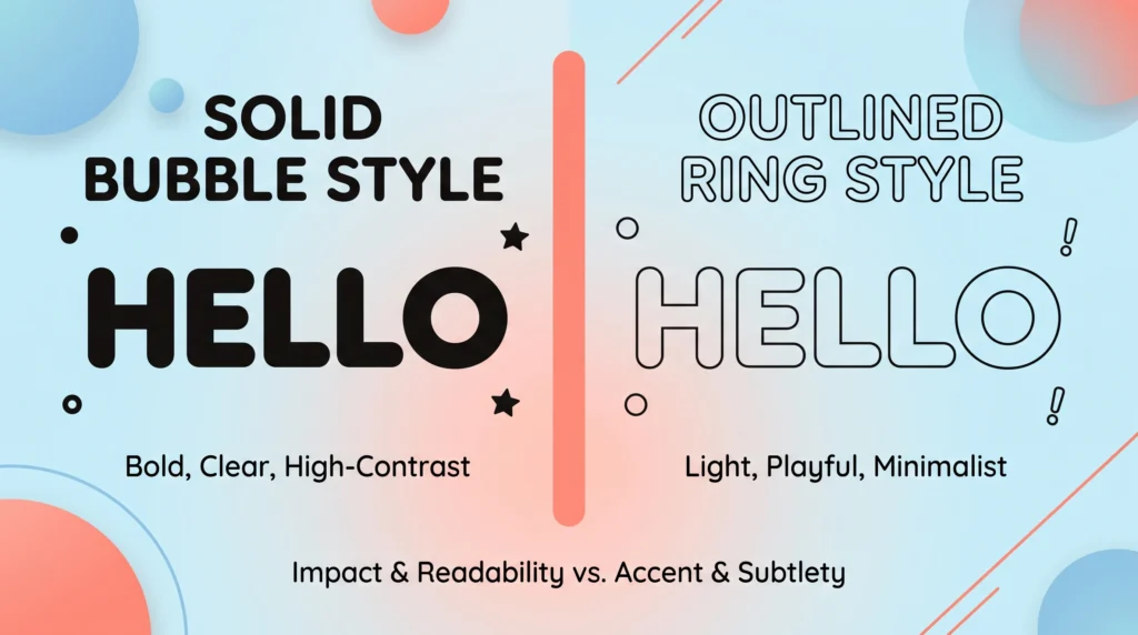
Both filled and outline bubble letters come from the same general idea in the Unicode Standard: take a normal letter and enclose it inside a circle. The difference is simply whether that circle is drawn as a solid shape or as an open outline. Filled bubble text (sometimes written as negative-circled letters) shows white or light-colored characters sitting inside dark, shaded circles. Outline bubble text uses plain circled letters where the ring is just a thin border and the letter itself stays dark, matching your regular text color, which is exactly the design choice behind filled vs outline bubble text.
Why Two Versions Exist at All
Font and symbol designers building out the Unicode block didn’t want to limit people to a single visual weight, so they included both a “light” and “heavy” version of circled letters, much like how a word processor gives you both regular and bold text. That variety is exactly what lets you pick a bubble font copy and paste option that actually matches the vibe you’re going for instead of settling for whatever shows up first, a weight difference that sits at the heart of filled vs outline bubble text.
When Filled Bubble Text Works Best
Filled bubbles carry more visual weight, which makes them ideal for situations where you want something to be immediately noticed. A Discord username sitting in a long member list benefits from that extra contrast, as does a short, punchy word in a TikTok caption that needs to grab attention while someone is scrolling fast. If bold, high-contrast text sounds like what you’re after, our bubble text generator converts your typed words into that heavier circled style in an instant, no design skills required, one of the clearest cases for choosing filled vs outline bubble text deliberately.
Where Filled Bubbles Can Feel Like Too Much
That same boldness can backfire in longer stretches of text. A full sentence written entirely in filled bubbles becomes genuinely hard to read, since each letter competes for attention rather than flowing naturally into the next. It’s best reserved for short bursts — a name, a single word, or a tag — rather than paragraph-length bios, part of why filled vs outline bubble text keeps coming up in style guides.
When Outline Bubble Text Is the Better Choice
Outline bubbles are quieter and more versatile. Because the circles are just thin borders, the text underneath still reads clearly even in longer strings, which makes it a solid pick for multi-line Instagram bios, longer Twitter posts, or anywhere you want a playful touch without sacrificing readability. It also tends to sit more comfortably next to emojis and other symbols without visually overwhelming them, a detail worth remembering when picking between filled vs outline bubble text.
A Quick Readability Note
Whichever style you choose, keep in mind that stylized Unicode text can render slightly differently across devices and fonts, sometimes appearing more cramped or spaced out than expected. If you’ve ever noticed fancy symbol text looking oddly wide or squeezed on certain screens, our article on why fancy fonts look wider or spaced out on screen explains what’s actually happening behind the scenes and how to work around it, another factor to weigh in the filled vs outline bubble text decision.
Testing Before You Commit
Before locking in a username or bio, it’s worth pasting your bubble text into the actual app you plan to use it on. A style that looks perfect in a generator’s preview box can render a bit differently once it hits Instagram’s font rendering or Discord’s chat display, so a quick real-world check saves you from an awkward surprise later, a reminder that filled vs outline bubble text can look different once it renders.
Related Bubble Text Reading
If you landed here wanting the full picture on how circled letters work in the first place, our overview of the bubble text generator and how it turns letters into circles is a good starting point before you dive into filled versus outline choices. And if bubble text has you curious about other unusual Unicode effects, our roundup of creative ways to use Zalgo text covers a completely different, much stranger corner of the same character set, which matters just as much for filled vs outline bubble text as anything else.
The Technical Backbone
All of these circled characters exist thanks to the Unicode Standard, the global system that assigns every character — letters, symbols, and beyond — its own permanent code point. You can browse the official Unicode character charts if you want to see the full scope of what’s available beyond basic bubble letters. Most circled and squared letters specifically live in a block Unicode calls Enclosed Alphanumerics, and the Enclosed Alphanumerics block entry on Wikipedia lays out exactly which symbols fall under that category, a quick check that applies to filled vs outline bubble text either way.
At the end of the day, filled and outline bubble text are just two flavors of the same fun idea, and neither one is objectively “better.” Try both, paste them into the platform you’re actually using, and let readability and vibe decide which circled style earns a spot in your bio, tying back to the broader filled vs outline bubble text comparison.
Frequently Asked Questions
Is one bubble text style more popular than the other?
Neither is objectively better. Filled bubbles carry more visual weight and suit bold headlines, while outline bubbles feel lighter and blend more comfortably into a busy, symbol-heavy bio, the same source behind every filled vs outline bubble text option available.
Do filled and outline bubble letters render the same everywhere?
Mostly, since both rely on standard Unicode, but it is worth pasting your chosen style into the actual app you plan to use before finalizing a username or bio, the last word on filled vs outline bubble text really comes down to preference.
Can I mix filled and outline bubble text in one bio?
Yes, and many people do, using filled bubbles for a headline and outline bubbles for supporting details. Just keep the mixing intentional rather than random so the bio still feels cohesive, so treat filled vs outline bubble text as two options worth testing side by side.