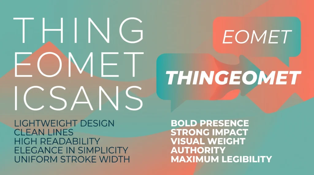
A bold italic text generator combines two Unicode styles into one character set, but stacking effects carelessly is exactly what makes a bio read as spammy instead of sharp. This guide covers what bold-italic text actually is, the three rules that keep it looking intentional, and which style combinations to avoid.
Table of Contents
Why Mixing Styles Is Riskier Than Using Just One
Bold text grabs attention. Italic text adds personality. Put them together carelessly, though, and a bio that was supposed to look sharp can quickly start reading like a spam comment, all caps energy dressed up in unusual letters. There’s a real skill to combining Unicode styles that most people never think about, because the tools make it so easy to stack every effect at once. The good news is that a bold italic text generator can absolutely produce a clean, professional-looking result, as long as you understand a few rules about when contrast helps and when it just creates noise.
What Bold Italic Unicode Text Actually Is
A bold italic text generator combines two separate character sets from the same corner of Unicode: the bold mathematical alphabet and the italic mathematical alphabet, merged into a single slanted, heavy-weight version of each letter. Both of these subsets live inside the same block of characters originally created for math notation, which Unicode formally documents as the Mathematical Alphanumeric Symbols range. Because bold-italic is its own distinct character set rather than two effects stacked on top of each other, it renders reliably wherever plain text works, without needing any actual formatting support from the app you’re pasting into.
The Three Rules for Combining Styles Without Looking Spammy
1. Contrast on Purpose, Not by Accident
The strongest combinations use bold-italic to draw the eye to exactly one thing, a name, a single headline word, or a short tagline, while everything else around it stays in regular text. The moment two or three different styles compete for attention in the same short bio, none of them actually stand out anymore, which is exactly the restraint a bold italic text generator rewards.
2. Match the Style to the Tone
Bold-italic reads as confident and a little bit dramatic, which fits gaming handles, brand taglines, or a punchy opening line well. It reads oddly on something meant to sound casual or friendly, where a plain italic touch, discussed in our guide to the italic text generator for social media, often fits the mood better than the heavier combined style.
3. Keep It Short
Bold-italic characters are visually dense. A single word or short phrase looks intentional; an entire paragraph in bold-italic looks like a formatting mistake, and on some devices, the letters can even start to overlap slightly at small font sizes because they were never designed for long-form reading, the main visual limit of any bold italic text generator.
A Simple Framework for Bio Layouts
Rather than guessing, it helps to think of a bio as having three tiers of visual weight:
- Tier one (most emphasis): one bold-italic line, usually a name or tagline, used once
- Tier two (medium emphasis): a plain bold or plain italic line for a secondary detail, like a location or job title
- Tier three (no emphasis): regular text for links, hashtags, or supporting information
This kind of layered structure is the same logic used in the copy-and-paste headline techniques covered in our piece on bold text best practices for headlines and bios, just extended to include a second style tier for extra contrast, showing how a bold italic text generator fits into a larger bio layout.
Common Combinations to Avoid
A few pairings tend to look cluttered rather than polished no matter how they’re arranged. Stacking bold-italic with a cursive or script font in the same short line usually creates too much visual competition, since both styles are already attention-grabbing on their own. If you’re drawn to a script look, our overview of fancy cursive alphabet letters and their uses is a better standalone choice than trying to force it alongside bold-italic in the same sentence, another reason to avoid overloading a bold italic text generator with extra styles.
It’s also worth remembering that Unicode styling works differently from how a website might apply emphasis with something like the CSS font-style property used to italicize text in code. On a website, a developer can apply, adjust, or remove that styling with a single line of code. With Unicode text, every character is fixed the moment you copy it, so there’s no way to “half-apply” a style later. That permanence is exactly why it pays to plan the combination before you paste it somewhere public.
Testing Before You Commit
Because rendering can vary slightly between apps, it’s worth pasting your final bold-italic line into the actual platform you’re using before finalizing anything. A combination that looks sharp in the generator’s preview window can occasionally appear cramped inside a narrow bio field on mobile. A quick preview costs nothing and saves you from having to redo a profile update twice, a habit worth building whenever you use a bold italic text generator.
It’s also worth checking how the line looks next to your profile photo and any existing emoji, since bold-italic characters sit slightly differently on the baseline than regular text. A combination that reads perfectly on its own can look oddly spaced once it’s surrounded by the rest of your actual bio, so give the finished layout one last look before you consider it done, a final check worth doing before trusting a bold italic text generator’s output.
Used sparingly and with a bit of intention, bold-italic Unicode text can make a single line genuinely pop, and that restraint is really the whole difference between a bio that looks designed and one that looks like it got carried away with the generator, the core takeaway for anyone reaching for a bold italic text generator.
Frequently Asked Questions
Is a bold italic text generator different from applying both styles separately?
Yes. A bold italic text generator produces a single dedicated Unicode character set rather than layering two separate effects, which is why it renders consistently everywhere plain text is accepted.
How much bold-italic text is too much in a bio?
As a rule of thumb, reserve it for one short line, like a name or tagline, and let regular text carry everything else. Multiple bold-italic lines competing for attention tend to look cluttered rather than polished.
Can I remove bold-italic styling once I’ve pasted it?
Yes, simply delete the styled characters and retype the text normally. The style lives entirely in the characters themselves, so there’s no formatting to strip out separately, so experimenting with a bold italic text generator carries no permanent risk.