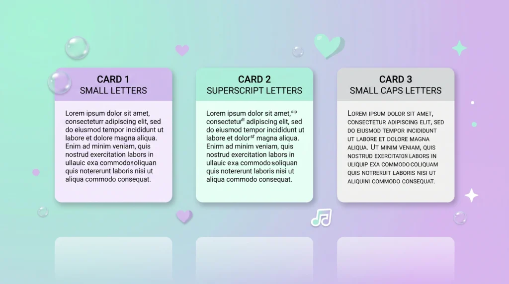
If you’ve seen “small text,” “tiny text,” and “small caps” tools that all promise the same shrink-your-letters effect, you’ve probably wondered whether there’s an actual difference. There is, and once you compare small text vs tiny text side by side, the gap becomes obvious: one style shrinks the whole word fairly evenly, while the other only shrinks part of it using superscript-style characters. This guide breaks down small text vs tiny text, and shows where small caps fits into the comparison, so you can pick the right one for your bio, username, or caption.
Table of Contents
Three Terms That Get Mixed Up Constantly
Scroll through enough text-generator sites and you’ll notice “small text,” “tiny text,” and “small caps” used almost interchangeably, as if they’re just three names for the same trick. They’re related, sure, but they’re not identical, and knowing the difference actually changes which one you should reach for depending on where you’re pasting it. This gets a little technical, but stick with it, because the distinctions are simpler than they sound once you see them side by side. Keeping small text vs tiny text straight from the start makes the rest of this comparison much easier to follow.
Small Caps: Uppercase Shape, Lowercase Height
Small caps are letters shaped like capital letters but sized closer to lowercase letters. Typographers have used this style for centuries in print, especially for acronyms and the first line of a chapter, because it reads as formal and polished without shouting the way full uppercase does. In the Unicode world, small caps characters occupy a specific block of code points designed to mimic that print tradition, which is why text converted into small caps still looks distinctly like capital letters, just shrunk.
Tiny Text: The Superscript-Style Miniature Look
Tiny text usually refers to superscript characters, the small raised symbols you’d normally see in a footnote marker or a mathematical exponent. Unlike small caps, tiny text characters sit slightly above the regular baseline and look uniformly miniature regardless of whether the original letter was uppercase or lowercase. This is the style most people mean when they ask for text that looks like it’s been shrunk down to a whisper, and it’s the specific style our complete guide to tiny text generators focuses on in detail. That superscript shrink is the core trait that separates tiny text from small text whenever people line up small text vs tiny text.
Small Text: The Umbrella Term
“Small text” tends to be used more loosely as an umbrella phrase covering both small caps and tiny superscript text, plus a few other miniature Unicode variants. When a tool or a search result says “small text generator,” it usually means you’ll get access to multiple miniature styles at once rather than just one specific format. That’s actually the more useful way to think about it: small text is the category, while small caps and tiny text are two of the specific styles living inside that category. Because it’s broader, small text often gets used as the catch-all term even in places where tiny text would technically be the more accurate label.
A Side-by-Side Comparison
- Small caps: ᴛʜɪs ʟᴏᴏᴋs ʟɪᴋᴇ ᴄᴀᴘɪᴛᴀʟ ʟᴇᴛᴛᴇʀs, ᴊᴜsᴛ sʜᴏʀᴛᴇʀ.
- Tiny/superscript text: ᵗʰᶦˢ ˡᵒᵒᵏˢ ᵘᶰᶦᶠᵒʳᵐˡʸ ᵗᶦᶰʸ ᵃᶰᵈ ʳᵃᶦˢᵉᵈ.
- Small text (general): often a mix, or whichever of the above a given generator defaults to.
Why the Difference Actually Matters
Picking the wrong style for the wrong context can look a little off. Small caps tend to work best for short, punchy labels, like a username or a single word you want to feel formal or refined. Tiny superscript text tends to work better for a whispery aside or a quiet caption, since it visually recedes more than small caps does, which is a useful detail to keep in mind when comparing small text vs tiny text.
If you’re building out a bio and want to combine both for contrast, our style guide for small text in TikTok and Twitter bios shows a few layouts where mixing styles actually improves readability instead of cluttering the profile. Getting small text vs tiny text backwards is a common enough mistake that it’s worth double-checking before you commit to a style for your profile, which is a useful detail to keep in mind when comparing small text vs tiny text.
Trying Them Out Yourself
The fastest way to see the differences in practice is to type the same phrase into the tiny text generator on this site and compare the small caps output against the superscript output side by side. Most people find they instantly prefer one over the other once they see both applied to their own words rather than a generic example. Running the same phrase through both tools is the quickest way to settle small text vs tiny text for yourself.
Where All of This Comes From
None of these styles are invented by any single website, they all draw from character blocks defined in the Unicode text encoding standard. That standard is maintained by the nonprofit Unicode Consortium. If you want to understand the underlying system a bit more broadly, including why it works identically across totally different devices and operating systems, our explainer on what Unicode text is and why it works everywhere is a solid next read, which is a useful detail to keep in mind when comparing small text vs tiny text.
Common Mistakes People Make Between the Three
One frequent mix-up is assuming small caps will look smaller overall than regular text, when really only the lowercase-height letters shrink, the visual weight of the word can still feel fairly substantial compared to true superscript tiny text. Another common error is converting an entire long sentence into superscript characters, which can strain readability on smaller phone screens since the letters lose some of their usual spacing cues. A safer approach is to reserve superscript-style tiny text for short phrases, a handful of words at most, and let small caps handle anything closer to a full sentence, since its shapes stay a bit more legible at length.
It also helps to remember that neither style is a true font in the traditional sense. You’re not installing anything or changing a setting, you’re simply choosing which pre-existing Unicode characters to paste into a text field. That means the “font” will always look the same no matter what device someone views it on, which is both the biggest strength of the trick and the reason it can never be customized beyond the character sets Unicode already provides.
A Quick Way to Decide
If you only remember one rule, use small text for anything longer than a couple of words, since it stays readable at sentence length, and save tiny text for a single short accent word or a tag at the end of a line. Small caps sits in between: pick it when you want a name, title, or short label to feel deliberate and a little more formal without shrinking it as far as tiny text would, which is a useful detail to keep in mind when comparing small text vs tiny text.
Running the exact same word through both tools and comparing small text vs tiny text on your own screen, in the app you’ll actually use it in, is still the most reliable test, since rendering can vary slightly between platforms. When in doubt, that side-by-side small text vs tiny text test settles it faster than reading about it, which is a useful detail to keep in mind when comparing small text vs tiny text.
A Note on Screen Readers and Accessibility
Both small text and tiny text are made from separate Unicode characters, not a font change, and most screen readers either skip them or read out strange labels like ‘mathematical alphanumeric symbol’ letter by letter. That’s a real trade-off worth knowing before you drop small text vs tiny text into something a visually impaired follower actually needs to understand, like a link caption or an important instruction.
For decorative flourishes in a bio or username, that trade-off is usually fine, since the surrounding regular text still carries the meaning. It’s a bigger deal if you’re replacing the only copy of a sentence with styled characters, so it’s worth keeping at least one plain-text version of anything essential nearby. That balance is exactly why small text vs tiny text choices matter more in some spots than others.
Picking the Style That Fits
None of these three terms is objectively “better,” they’re just different tools for slightly different visual effects. Once you can tell small caps, tiny text, and the broader small text category apart at a glance, choosing the right one for your bio, username, or caption becomes a lot less like guesswork and a lot more like an actual design decision.
Frequently Asked Questions
What’s the real difference between small text vs tiny text?
Small text uniformly shrinks every letter in a word, while tiny text usually relies on superscript-style Unicode characters that only shrink part of the shape. When people compare small text vs tiny text side by side, that’s the detail that actually separates the two, not just how small the end result looks. Keep that small text vs tiny text distinction in mind and the rest of this comparison falls into place quickly.
Which should I use for a bio, small text vs tiny text?
For a full bio line, small text tends to stay more readable, since tiny text’s superscript shapes can get cramped over a long sentence. Save tiny text for short accents, a single word or emoji-length phrase, and let small text carry anything longer.
Is small caps the same as small text or tiny text?
No. Small caps keeps letters at capital-letter shapes but lowercase height, which is a separate visual trick from both small text and tiny text. It’s a useful third option once you’ve decided between small text vs tiny text and still want something with a bit more formal weight.
Do numbers and emoji work the same way in both styles?
Mostly, but not perfectly. Unicode has small text vs tiny text equivalents for letters and most digits, but coverage thins out for punctuation and it doesn’t touch emoji at all, since emoji are separate image-like characters rather than styled letters. If a specific symbol won’t convert, that’s usually why, and mixing plain punctuation or emoji in with your styled letters is normal and expected rather than a mistake.