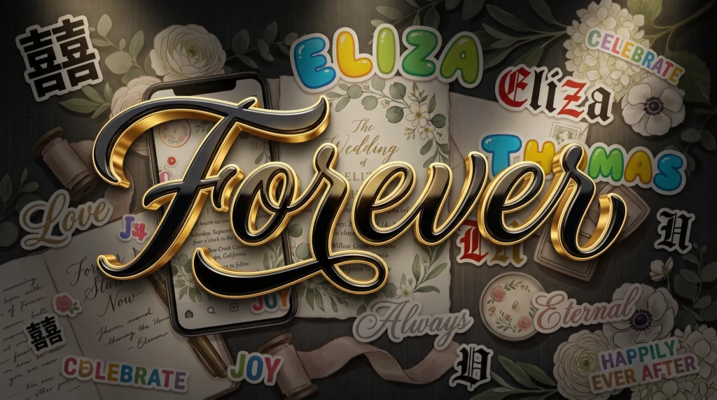
Bold cursive text combines two separate Unicode character sets into one style, giving script lettering enough visual weight to stand out in a busy feed without losing its handwritten feel. This guide covers how the two styles actually stack together, where bold cursive works best, and how it compares to other dramatic text effects.
Table of Contents
When Delicate Script Needs a Little More Weight
Regular cursive text has a soft, romantic feel that works beautifully for wedding hashtags and gentle bios, but it isn’t always the right fit. Sometimes you want script letters that still read as flowing and handwritten, just with more visual punch — something that stands out in a crowded feed or a Discord member list instead of blending in. That’s exactly the gap a bold cursive generator fills, combining two separate styling ideas into a single line of text.
Two Unicode Tricks Layered Into One
To understand bold cursive text, it helps to know that “bold” and “cursive” are actually two completely different Unicode character blocks doing two different jobs. Cursive characters come from the Mathematical Alphanumeric Symbols range designed to mimic script handwriting, while bold characters come from a separate set built to look thicker and heavier. A bold cursive generator simply picks the characters that were designed to be both at once — thick-stroked, script-style letters that exist as their own dedicated symbols.
Not the Same as Making Regular Cursive “Bold” With a Toggle
This is a common point of confusion. You can’t take plain cursive text and press a bold button on your phone to thicken it, because there’s no real font behind it to modify — it’s already a fixed set of characters. If you want a deeper explanation of how these separate character sets stack up against plain italic or combined styling, our article comparing cursive text generators against genuine handwriting fonts covers the mechanics in more depth.
Getting Bold Script Text in a Few Seconds
The process is nearly identical to any other Unicode text conversion, which is part of why it’s so popular:
- Type your desired word or phrase into the generator’s text box.
- Scan the list of instantly generated styles, including the bold script variation.
- Click to copy the version that has the weight and flow you’re after.
- Paste it into whichever app or profile field you’re customizing.
Our own bold cursive generator produces this style along with several related options, so you can compare thickness and flow before deciding which one matches your brand or profile.
Best Places to Actually Use Bold Cursive
Bold script text tends to earn its keep in spots where you need script’s personality but also need to be noticed. Business or brand bios often favor it over plain cursive because it stays legible and confident even at small sizes on a phone screen. It also plays well in more sentimental contexts once you dial back the boldness slightly, which is why it’s worth pairing this approach with the softer inspiration in our guide to using cursive fonts for wedding invites and social bios if you’re deciding between a bold or delicate look for an event.
A Word on Overuse
Because bold script characters are visually loud by design, using them for an entire paragraph gets tiring fast and can even look like a formatting error to readers unfamiliar with styled Unicode text. Save the boldest script for a name, a headline, or a single standout line, and let regular text carry the rest of the message, which is really the biggest usability risk with bold cursive text.
How This Differs From Other Dramatic Text Effects
Bold cursive is intentionally readable — it’s meant to be noticed, not to obscure your message. That puts it at the opposite end of the spectrum from glitch-style text effects that stack accent marks until words become chaotic and hard to read, a style we unpack fully in our breakdown of how the Zalgo glitch text effect works. Choosing between the two really comes down to whether you want your text to grab attention while staying clear, or to look deliberately unsettling.
Script handwriting has always carried a sense of formality and craftsmanship, something the Wikipedia overview of cursive writing traces back long before digital text existed. Bold cursive characters simply borrow that visual heritage and adapt it for screens. If you want to see exactly which characters make this possible, the official Unicode character charts list every symbol in the relevant blocks, which is exactly the visual heritage bold cursive text borrows from.
Pairing Bold Script With Symbols and Spacing
One reason bold cursive text photographs and screenshots so well is that it holds up next to other visual elements instead of getting drowned out. A thin cursive word can disappear against a busy background image or a colorful app icon, but the added weight of bold script keeps the letters visible even when they’re layered over a photo. Many people combine it with a couple of simple symbols, like small stars or dividers, on either side of a name to frame it without cluttering the rest of the bio.
Spacing Makes a Bigger Difference Than People Expect
Because script characters already lean and connect visually, cramming them together with no spaces can make short phrases hard to read at a glance, especially on smaller phone screens. Leaving a single space between words, and avoiding stacking bold cursive directly next to other heavily styled text, keeps the final result looking intentional rather than accidental. A quick preview before posting is always worth the extra few seconds it takes, the biggest practical tip for pairing bold cursive text with symbols.
Bold cursive text gives you a way to keep the elegance of script lettering while making sure it doesn’t get lost in a busy feed or chat window. Try a phrase, compare the weighted and regular script options side by side, and pick whichever one matches the tone you’re going for — bold and eye-catching, or soft and understated.
Frequently Asked Questions
Can I make regular cursive text bold with a formatting button?
No. Bold cursive text is its own dedicated set of Unicode characters, not regular cursive with a bold style applied, so there’s no toggle that converts one into the other after the fact.
Where does bold cursive text work best?
It tends to work best for a name, headline, or single standout line, especially over busy backgrounds or photos where a thinner script style might get lost, the same reason bold cursive text tends to outperform plain script over photos.
Is bold cursive text different from Zalgo or glitch text?
Yes. Bold cursive is meant to stay readable while grabbing attention, while glitch-style effects intentionally stack characters to look chaotic and harder to read, a distinction worth knowing before you settle on bold cursive text for a name.