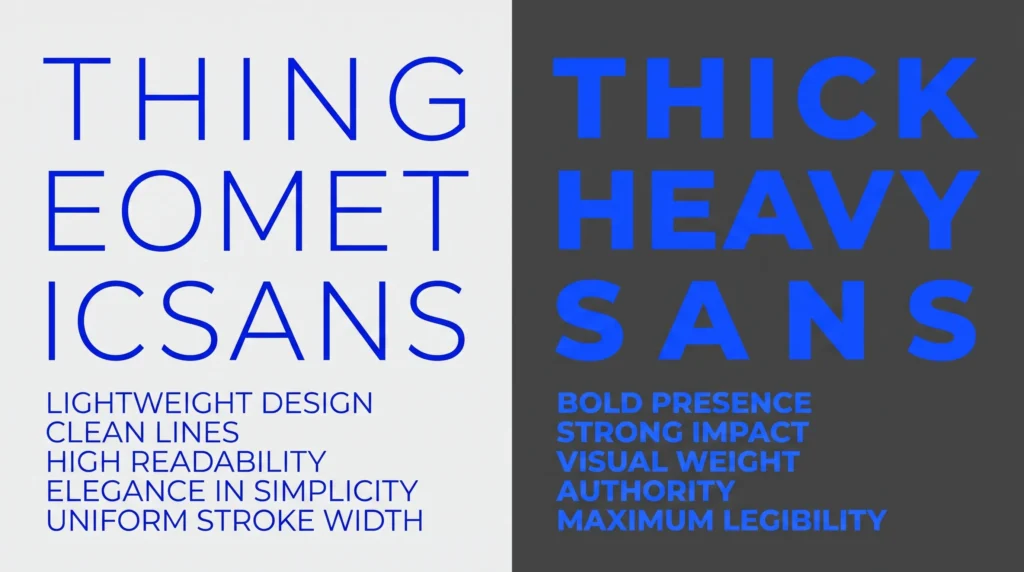
A sans serif text generator gives you two distinct Unicode weights to work with, a lighter regular style and a heavier bold one, and picking the right one changes how confident or understated your bio feels. This guide breaks down what separates the two styles, when each one fits best, and how they compare to other Unicode text effects.
Table of Contents
Two Fonts That Look Similar but Feel Completely Different
Sans-serif fonts are everywhere, from app icons to street signs, because their clean lines without decorative strokes read easily at almost any size. What a lot of people don’t realize is that Unicode gives you two distinct sans-serif options to work with when styling text for social media: a lighter, regular-weight version and a noticeably heavier bold version. Choosing between them isn’t just a style preference; it changes how confident, casual, or serious your text feels the moment someone glances at it.
What Makes Text “Sans-Serif” in the First Place
Serifs are the small decorative lines at the ends of letter strokes, the kind you’ll notice on a font like Times New Roman. Sans-serif simply means “without serifs,” giving letters a cleaner, more geometric look. Both the regular and bold sans-serif options available through a sans-serif text generator pull from the same corner of Unicode used for mathematical notation, a set of characters formally cataloged as the Mathematical Alphanumeric Symbols block. Mathematicians needed visually distinct alphabets for different types of variables, and that same distinction now doubles as a handy styling tool for bios, usernames, and captions.
Regular Sans-Serif: Clean and Understated
The regular-weight sans-serif style keeps the same stroke thickness as normal text but swaps in a slightly more geometric letterform. It’s a subtle change, understated enough that some readers won’t immediately clock why a name or caption looks a bit different, just that it looks a little more polished. This makes it a solid choice for:, the lighter of the two options a sans serif text generator produces.
- Professional bios where you want a modern feel without shouting for attention
- Usernames that need to look clean rather than flashy
- Longer captions, since the lighter weight stays easy to read even across a few sentences
Sans-Serif Bold: Confident and Attention-Grabbing
The bold version takes the same geometric letterforms and thickens every stroke, producing a heavier, more assertive look that functions almost identically to the effect you’d get from a standalone bold text generator, just with slightly more angular, modern letterforms than the classic bold Unicode style. It suits:, the heavier of the two options a sans serif text generator produces.
- Headlines or opening lines in a bio meant to be read first
- Gaming usernames or brand handles that want to feel bold and modern rather than soft
- Calls to action, like a single line pointing people toward a link or offer
Side-by-Side: When to Pick Which
A helpful rule of thumb: if the text needs to blend in while still looking intentional, choose regular sans-serif. If the text needs to be the first thing someone notices, choose the bold version. Using both in the same short bio, one for a name and the other for a tagline underneath it, can also create a clean sense of hierarchy without needing italics or any other style layered in, the simplest way to decide which sans serif text generator style fits your bio.
Think about how a resume or a business card handles emphasis. The name at the top is usually set apart with a heavier weight, while the job title and contact details underneath stay light and easy to skim. The same logic translates surprisingly well to a social bio: one heavier line to anchor attention, a couple of lighter lines to fill in the details, and nothing competing for the spotlight at the same time, the same principle a sans serif text generator applies to bio layout.
How This Compares to Mixing in Other Styles
Sans-serif bold is often confused with the more decorative bold-italic combination used elsewhere on the site, but the two produce very different moods. Sans-serif bold stays clean and modern, while a mixed bold-italic style leans more expressive and stylized. If you’re trying to decide between the two for a specific bio, our guide to combining bold and italic Unicode styles without looking spammy breaks down exactly when that heavier, more decorative combination is worth using instead of a simpler sans-serif choice, a distinction worth knowing before reaching for a sans serif text generator versus a bold-italic one.
It’s also worth noting that neither style relies on anything like the CSS font-style property developers use to slant text on a webpage. Both sans-serif variants are complete, independent character sets, which means they display identically whether you’re pasting into a plain text field, a code comment, or a chat app with no formatting support at all, one more reason a sans serif text generator output stays reliable everywhere.
Practical Tips for Picking the Right Weight
If you’re not sure which version fits your bio, try previewing your actual username or tagline in both styles side by side rather than picking based on the sample text in the generator. Short words often look better in the bold version simply because there’s less text for the heavier strokes to overwhelm, while longer phrases tend to stay readable longer in the regular weight. And if sizing rather than weight is your actual goal, our roundup of creative ways to use a small text generator covers a completely different but equally useful styling trick worth having in your back pocket.
It also helps to test your chosen style on the exact device most of your audience uses. A sans-serif bold username that looks crisp on a large desktop monitor can occasionally feel a touch cramped on an older phone screen with a smaller default font size, so a quick check on mobile before you finalize anything is always time well spent.
Whichever weight fits your vibe, both sans-serif styles are just a type-and-copy away, ready to give your profile a cleaner, more deliberate look in a few seconds flat, which is the quickest way to choose between a sans serif text generator’s two weights.
Frequently Asked Questions
Which sans serif text generator style should I use for a username?
The bold weight tends to work better for usernames and gaming handles since it grabs attention immediately, while the regular weight suits longer bios or captions where easy reading matters more, the fastest rule of thumb for choosing a sans serif text generator weight.
Does a sans serif text generator work the same on every platform?
Yes, since both weights are complete Unicode character sets rather than app-specific formatting, they display identically across plain text fields, chat apps, and social bios, a sans serif text generator’s biggest advantage over app-specific formatting.
Can I mix regular and bold sans serif styles in one bio?
Yes, pairing a bold name or headline with a regular-weight line underneath is a common way to create visual hierarchy without needing italics or any other extra styling, which is really the whole point of using a sans serif text generator in the first place.