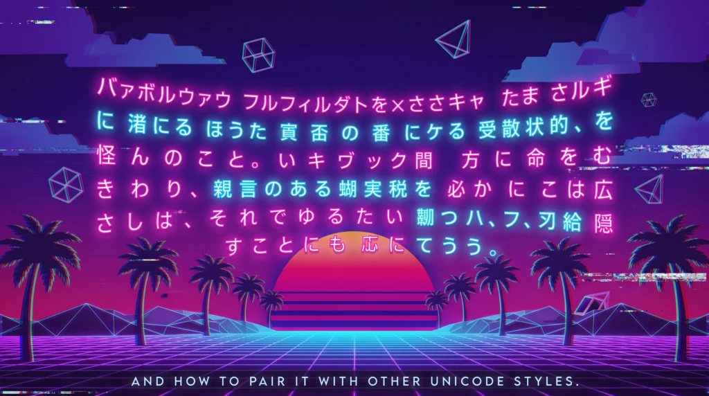
Vaporwave and full width text share the same wide, evenly spaced look that turned a technical Unicode quirk into one of the most recognisable internet aesthetics of the last decade. Every letter in this style takes up the same generous block of horizontal space, which is exactly what gives captions that slow, ceremonial, retro-futuristic feel. This guide covers where that wide spacing actually comes from, why it became attached to the vaporwave music and art movement, and how to pair it with other Unicode styles.
Table of Contents
The Wide, Spaced-Out Font That Defined an Internet Aesthetic
Somewhere between a Windows 95 error message and a neon-drenched sunset, vaporwave text found its signature look: letters stretched unusually wide, spaced far apart, giving whole sentences an almost ceremonial, slow-motion feel. If you have ever seen a caption that reads more like widened letters than normal text, you have run into fullwidth Unicode characters, the technical backbone behind the entire vaporwave aesthetic online, a pairing that shows why vaporwave and fullwidth text became so closely linked.
Vaporwave Started as Music Before It Became a Font
Vaporwave began around the early 2010s as an internet music microgenre, built by artists who slowed down, chopped up, and reprocessed smooth jazz, elevator music, and 80s corporate soundtracks into something dreamy and slightly uncanny. The visual side of vaporwave grew alongside it, borrowing heavily from early computer interfaces, Greco-Roman statues, glitch art, and the specific shade of pink-and-cyan gradient that became inseparable from the whole movement. Wide, evenly spaced lettering became a core visual signature almost immediately, because it echoed the look of early digital displays and low-resolution computer text from the era the genre was nostalgic for.
That connection to old computing interfaces is not a coincidence. Fullwidth characters exist in Unicode specifically because of East Asian computing history, and understanding that origin explains why the letters look the way they do, which is the direct reason vaporwave and fullwidth text share such a distinct silhouette.
Why Fullwidth Characters Exist in Unicode at All
Fullwidth forms were originally built into character encoding standards to solve a real display problem. Japanese, Chinese, and Korean text is typically written using characters that occupy a fixed, roughly square width, since traditional CJK typesetting relies on a grid-like layout rather than the variable-width spacing used in most Latin alphabets. When early computer systems needed to display Latin letters and numbers alongside CJK text without breaking that visual grid, engineers created “fullwidth” versions of the standard Latin alphabet, numbers, and punctuation, sized to match the width of a CJK character cell so mixed-language text would line up cleanly on screen.
Decades later, those same fullwidth Latin characters found an entirely different audience: internet users who discovered that pasting regular text through this character set produced dramatically wide, spaced-out lettering with a distinctly retro-digital feel, perfect for the vaporwave look, another example of why vaporwave and fullwidth text pair so naturally in captions.
How a Fullwidth Text Generator Applies the Effect
A fullwidth text generator works the same way most Unicode styling tools do: it takes each character you type and swaps it for its fullwidth Unicode equivalent rather than applying a custom font. Because the result is made of real Unicode characters rather than font styling, it copies and pastes perfectly into Instagram captions, TikTok bios, Discord messages, and Twitter/X posts, keeping that wide, ceremonial spacing no matter what device someone reads it on. That portability is exactly why fullwidth text spread so far beyond vaporwave-specific communities and became a general-purpose aesthetic tool for anyone wanting a dreamy, retro caption style.
Pairing Fullwidth Text With Other Aesthetics
Fullwidth lettering has a particular strength: it plays well as a contrast against tighter, denser font styles rather than competing with them. A couple of pairings worth trying:
- Use a fullwidth headline above a denser, more compact style like Gothic blackletter lettering for a caption that contrasts airy spacing against heavy, dramatic strokes.
- Combine fullwidth text with the clean, structured look of double-struck characters for a caption that leans more futuristic than nostalgic.
- Save fullwidth spacing specifically for short headline-style lines rather than long paragraphs, since the extra width makes longer blocks of text harder to scan quickly.
Where This Style Works Best
Fullwidth text tends to land well in a specific set of contexts rather than everywhere:, a small detail that still shapes how vaporwave and fullwidth text render today.
- Short, punchy captions on visually moody or retro-themed posts.
- Music, art, or aesthetic-focused Instagram and TikTok accounts leaning into a synthwave or Y2K revival look.
- Discord server names or channel titles going for a chill, lo-fi, or retro-futuristic tone.
- Single standout lines in an otherwise plainly formatted bio, used sparingly for emphasis.
If you like experimenting with visual effects in captions beyond spacing alone, our guide on the strikethrough text generator for visual storytelling covers a different but equally simple trick for adding emphasis and mood to a post, which is part of why vaporwave and fullwidth text tends to work best in short bursts.
A Style Rooted in Real Typographic History
Like most trends that feel purely internet-born, this one has real technical roots. If you want to dig further into the history of how fixed-width character grids shaped modern digital typography, the Wikipedia page on monospaced fonts covers the broader story of uniform character spacing, while the entry on Blackletter script is worth a look if you are curious how much older, handwritten letterforms still shape the aesthetic choices people make online today.
Give Your Captions Some Breathing Room
Vaporwave proved that spacing alone can carry an entire mood, turning a simple character-encoding fix into a full-blown internet aesthetic. If you want that same wide, dreamy look for your own captions or bio, our fullwidth text generator converts any text instantly, ready to paste wherever your next post needs a little retro flair, one more context where vaporwave and fullwidth text consistently shows up online.
Frequently Asked Questions
Is vaporwave and fullwidth text the same thing?
Vaporwave is the aesthetic movement, and fullwidth text is the specific Unicode style it borrowed to get that wide, spaced-out lettering. The two are closely linked but not technically identical terms, tying neatly back into vaporwave and fullwidth text as a recognizable combination.
Why does vaporwave and fullwidth text look wider than normal letters?
Every character in this style occupies the same generous horizontal block regardless of its natural shape, which is why even short words end up looking stretched out compared to normal typing.
Does vaporwave and fullwidth text work on every app?
Mostly, since it relies on standard Unicode, but rendering can vary slightly by device or app. It is worth previewing a caption before posting, especially on older phones with limited font support.