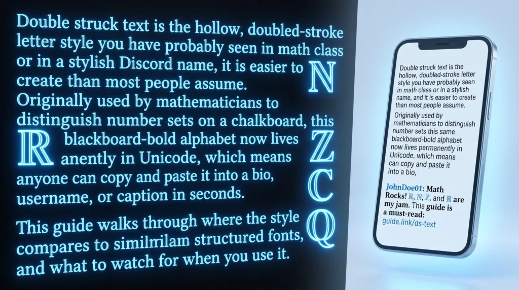
Double struck text is the hollow, doubled-stroke letter style you have probably seen in math class or in a stylish Discord name, and it is easier to create than most people assume. Originally used by mathematicians to distinguish number sets on a chalkboard, this same blackboard-bold alphabet now lives permanently in Unicode, which means anyone can copy and paste it into a bio, username, or caption in seconds. This guide walks through where the style came from, how it compares to similar structured fonts, and what to watch for when you use it.
Table of Contents
That “Hollow” Font You Keep Seeing Is Older Than You Think
If you have ever noticed usernames or bios written in letters that look outlined or “double-lined,” like a letter drawn with two parallel strokes instead of one, you have seen double-struck text. It has a distinctive, almost stamped quality, and it shows up everywhere from Discord names to Twitter bios. What most people do not realize is that this exact letterform was not invented for social media at all. It was invented by mathematicians who needed a way to write on chalkboards without confusing two different meanings of the same letter, which is the core visual signature of double struck text.
Why Mathematicians Started Doubling Their Letters
In standard math notation, a bold capital letter like R or N often means something specific, such as the set of real numbers or natural numbers. The problem is that chalk does not do bold. You cannot press harder on a chalkboard and get a thicker line the way you can with a pen, so mathematicians in the early-to-mid 20th century, working largely out of the Bourbaki group of French mathematicians, started drawing certain letters with a doubled or struck-through vertical stroke instead. This “blackboard bold” style let them preserve the special meaning of bold notation using nothing but a regular piece of chalk, the same convention that underlies double struck text today.
Over time, this convention became standard enough that it made its way into printed textbooks and journals too, even though those obviously did not have the chalk limitation. It simply became the accepted way to denote specific number sets: ℝ for real numbers, ℕ for natural numbers, ℤ for integers, ℚ for rational numbers, and ℂ for complex numbers. Anyone who has taken a college-level math course has almost certainly seen these symbols on a whiteboard or in a textbook, cementing double struck text as the standard way to denote these sets.
From Chalkboards to Unicode
When the Unicode Consortium built out the standard character set that powers text across every modern device, it included a dedicated block for these blackboard bold letters so that mathematical documents could be typed digitally instead of hand-drawn. That block covers the full alphabet in both uppercase and lowercase, plus the digits 0 through 9, all rendered in that same hollow, doubled style. This is the exact character set that double-struck text generators tap into today. Typing your name or bio text into one of these tools does not apply a custom font; it swaps each letter for its matching Unicode double-struck character, the same characters mathematicians have been using in academic papers for decades.
Why It Caught On for Usernames and Bios
Because double-struck characters are real Unicode symbols rather than font styling applied through an app, they copy and paste perfectly across almost any platform, including Instagram, TikTok, Discord, Twitter/X, and even most texting apps. That portability is a big part of why the style spread far beyond its mathematical origins. It has a clean, geometric, almost futuristic look that reads well in a bio header or a gaming handle, and it stands out precisely because most people are used to seeing it in a very different, much more academic context, a small quirk that gives double struck text its novelty appeal.
There is also a novelty factor. Most casual social media users have no idea double-struck text comes from math class, which gives it a bit of an “I found something unusual” appeal compared to more common styles like basic bold or italic, part of why double struck text still feels fresh to casual users.
Double-Struck vs. Other Boxy, Geometric Styles
Double-struck often gets grouped with other structured, uniform-looking fonts because of its clean geometry. It is worth knowing how it differs from a couple of relatives:, helping explain how double struck text fits among other structured styles.
- Double-struck letters use a hollow, doubled-stroke outline for every character, giving a stamped or academic feel.
- Monospace letters keep every character the same width, giving a typewriter or code-editor look rather than an outlined one. If that fixed-width style interests you, our breakdown of the monospace text generator and why coders love it covers where that font style comes from.
- Fullwidth letters stretch normal characters out to occupy more horizontal space, which is a completely different visual trick explained in our piece on vaporwave and fullwidth text.
Mixing double-struck letters with one of these other structured styles can create a nice visual rhythm in a bio, since they all share that clean, geometric personality without looking identical, since double struck text and its geometric cousins share a common visual language.
A Couple of Things to Watch For
Because double-struck characters live in a less commonly used part of the Unicode standard, older devices or certain apps with limited font support can occasionally show them as blank boxes instead of the intended letter. It is always worth pasting your text into the actual destination app before locking in a username, just to double-check it renders properly on the devices your audience is likely using. If you are curious about the deeper technical history of monospaced typefaces referenced above, the Wikipedia page on monospaced fonts goes into the printing and typewriter history behind it, and if angular, historic lettering is more your interest, the entry on Blackletter script is a good companion read.
If you are setting up a new Instagram bio and want ideas for combining styles like this one, our guide on making small text for your Instagram bio walks through several pairings that work well together, making double struck text an easy addition to any bio refresh.
Give the Math Class Font a Try
It is a strange bit of internet trivia that one of the more distinctive fonts on your favorite app started life as a workaround for chalk dust. If you like the look, our double-struck text generator converts any text you type into that same hollow, blackboard-bold style, ready to paste anywhere in seconds.
Frequently Asked Questions
Is double struck text real Unicode or just an image?
It is real Unicode text, not an image. Every double struck character comes from an actual Unicode code point, so it can be typed, copied, pasted, searched, and read by screen readers just like normal letters, even though it looks hand-drawn, which is exactly why double struck text renders reliably as real Unicode.
Why do some apps show double struck text as a blank box?
A blank box usually means the app or device’s font does not include that part of the Unicode standard yet. Older phones and some in-app browsers are the most common culprits, so it is worth testing your text in the destination app before you commit to it.
Can I use double struck text in a username?
Most platforms accept it since it is standard Unicode, but a few strict username fields filter out anything beyond basic Latin letters. If a platform rejects it, bios, captions, and display names are usually a safe place to use the style instead.