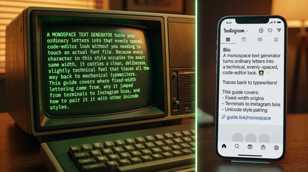
A monospace text generator turns your ordinary letters into that evenly spaced, code-editor look without you needing to touch an actual font file. Because every character in this style occupies the exact same width, it carries a clean, deliberate, slightly technical feel that traces all the way back to mechanical typewriters. This guide covers where fixed-width lettering came from, why it jumped from terminals to Instagram bios, and how to pair it with other Unicode styles.
Table of Contents
The Font Built So Every Letter Takes Up the Same Space
Open any code editor, terminal window, or old-school typewriter document and you will notice something the average font does not do: every single character, from a skinny “i” to a wide “m,” takes up exactly the same amount of horizontal space. That is monospace type, and it is one of the most functional font styles ever created. It is also, somewhat unexpectedly, having a moment on social media, where people are copying monospace Unicode characters into bios and usernames for a clean, code-like aesthetic that reads as effortlessly techy, the same fixed-spacing logic a monospace text generator recreates today.
Where Fixed-Width Type Actually Came From
Monospaced type predates computers by a long way. Mechanical typewriters, which became widely used in offices starting in the late 1800s, relied on a simple mechanism: each key struck the paper and advanced the carriage by a fixed distance, regardless of which letter was typed. Building a typewriter that could vary spacing based on letter width would have required far more complex engineering than was practical at the time, so fixed spacing became the default simply because it was easier to build, which is exactly the constraint a monospace text generator mimics on purpose.
That practical constraint stuck around far longer than the typewriters themselves. When early computer terminals and printers were developed in the mid-20th century, they inherited the same fixed-width logic, largely because it was computationally simpler to render a grid of identical character cells than to calculate variable spacing for every glyph. Programming languages, terminal interfaces, and early word processors all leaned into monospace fonts as a result, and the style became permanently associated with anything technical. It is a very different lineage from ornamental type families like blackletter scripts, which were designed for visual weight and history rather than mechanical convenience.
Why Programmers Still Insist on It
You might assume coders stuck with monospace fonts purely out of nostalgia, but there is a real functional reason it survived the jump to modern, high-resolution screens: alignment. When every character occupies identical width, columns of code, tables of data, and indentation all line up perfectly. A programmer scanning through nested brackets or comparing two lines of similar code relies heavily on that visual alignment to spot mistakes quickly. Swap in a proportional font, where an “i” and a “w” take up different amounts of space, and that alignment collapses, making code meaningfully harder to read at a glance.
The same logic applies to spreadsheets, terminal output, and anything involving tabular data, which is part of why monospace fonts remain the default in nearly every code editor and command-line tool today. For more background on how this typeface family evolved from mechanical constraint into a permanent design choice, the Wikipedia page on monospaced fonts is a genuinely interesting deep dive, a big part of why a monospace text generator feels so instantly readable.
Why Monospace Migrated Into Bios and Usernames
Social media users do not care about column alignment, so why did this font jump from terminals to Instagram? Mostly aesthetics. Monospace text has an evenly weighted, deliberate look that reads as clean and minimal rather than decorative. It signals a certain kind of personality too, evoking hacker culture, indie software projects, retro computing, and the kind of understated design sensibility associated with developer portfolios. For creators building a tech-forward, minimalist, or slightly retro brand, monospace lettering communicates that instantly without needing any extra explanation in the bio itself, one more reason people reach for a monospace text generator when styling a bio.
Like most styled text online, this effect is achieved with Unicode characters rather than an actual custom font file. A monospace text generator swaps your regular letters for the Unicode monospace block, which means the styled result keeps its fixed-width look and copies cleanly into Discord names, TikTok captions, Twitter/X bios, and most texting apps, regardless of what font the app itself is using, which is the core trick behind every monospace text generator you will find online.
Pairing Monospace With Other Styles
Monospace lettering has a quiet, structured personality, which makes it a nice contrast against louder or more decorative styles rather than a clash. A few combinations worth trying:, showing how a monospace text generator can complement rather than clash with other styles.
- Pair a monospace username with a double-struck header for a layered, math-meets-code aesthetic that feels intentional rather than random.
- Use monospace for body bio text and save a wider, more decorative style like fullwidth vaporwave lettering for a single attention-grabbing line at the top.
- Contrast structured monospace with something flowing and ornamental, such as a fancy cursive alphabet style, if your profile mixes a technical vibe with a softer personal touch.
Where It Works Best
Monospace shines in places where a clean, understated, slightly technical tone fits the content:
- Developer, designer, or startup-founder bios on Twitter/X and LinkedIn-adjacent platforms.
- Discord servers built around coding communities, gaming development, or tech discussion.
- Portfolio links and “now playing” or “currently building” style bio lines that borrow a command-line feel.
- Minimalist aesthetic pages that intentionally avoid flashy or bubbly fonts.
As with any Unicode-based styled text, double-check how it renders on the specific app you are using before finalizing a username, since older devices occasionally struggle with less common character blocks. It is a quick check that saves you from an inconsistent-looking profile later, a nod to how a monospace text generator can carry a coding-adjacent personality.
Bring the Terminal Look to Your Bio
From typewriter carriages to command-line interfaces to Instagram bios, fixed-width letters have quietly stuck around because they simply work. If that clean, structured look fits the vibe you are going for, our monospace text generator turns any text into that same evenly spaced style, ready to copy and paste wherever you need it, the kind of detail a monospace text generator makes effortless.
Frequently Asked Questions
Is a monospace text generator the same as changing my font?
Not quite. A monospace text generator swaps regular letters for Unicode characters that already look fixed-width, so it works anywhere you paste text, unlike an app font setting that only applies inside one platform, further proof a monospace text generator can slot into a varied bio.
Will monospace text look the same on every app?
Mostly, but not always. Because the style relies on a specific Unicode block, older devices or apps with limited font support can occasionally render it as blank boxes, so it is worth checking before finalizing a username.
Why do developers like monospace styling in bios?
It signals a technical, minimalist personality without extra explanation. The evenly weighted letters read as clean and deliberate, which fits portfolios, coding-focused accounts, and retro-computing aesthetics particularly well.